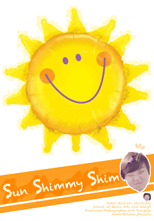
 This is my personal poster. I tried to be crazy, so I used my extreme face-expression-pictures, and my name is Sun, so I picked Sun and Yellow as my theme. I feel like I should add more artifacts to this, but I just wanted to be simple :) I really wanted to think about repetition and composition. Since this was about my personal components, I wanted to have my 'personal' theme. I think it had a pretty strong impact since the background was white. I used grouping feature on Photoshop to group similar components together so that when I tried to move around, it was definitely easier for me. Even thought it doesn't have much of fancy design skills, I still love my poster :)
Thursday, February 2, 2012
Personal Poster: Photoshop
 This is my personal poster. I tried to be crazy, so I used my extreme face-expression-pictures, and my name is Sun, so I picked Sun and Yellow as my theme. I feel like I should add more artifacts to this, but I just wanted to be simple :) I really wanted to think about repetition and composition. Since this was about my personal components, I wanted to have my 'personal' theme. I think it had a pretty strong impact since the background was white. I used grouping feature on Photoshop to group similar components together so that when I tried to move around, it was definitely easier for me. Even thought it doesn't have much of fancy design skills, I still love my poster :)
Subscribe to:
Post Comments (Atom)
Since we are trying to deliver a message about ourselves I believe you have a lot of good ideas that work. Using your picture and a picture of a smiling sun shows us that you like to be happy. You also have all about you in the bottom right corner, which tells us more about you.
ReplyDeleteI believe you could improve the size of the font. Since this isn't a huge aspect of your creation I don't think it's a huge deal, but it's hard for the viewer to even read it. It probably was easier to read on your own screen. I think you have a lot of positive things going on here, but one thing I would suggest for you to try next time is to add a few more objects or images. This would allow us (the viewers) to get to know more about you through images.