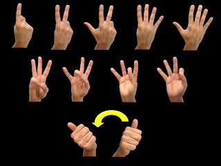
 pictures BEFORE edited
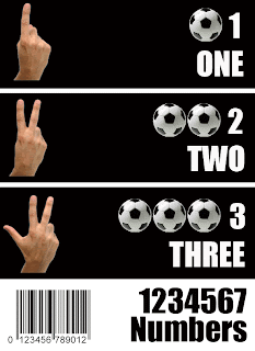
 AFTER edited with photoshop
It looks more of a poster than a worksheet for learning. I wanted to create something for sign language, but cropping out all the alphabet took me a very long time, so I just chose the younger age children for my target population. Even thought it was a poster for learners, I wanted to be a little more creative, so I added bar code picture at the bottom to make it more of a poster than just a worksheet. I think harmony here is the font color, size, and the space between texts. I wanted be nearly perfect with the spacing so I zoomed in a lot to compare the length and width.
No comments:
Post a Comment