Tuesday, February 28, 2012

Alignment


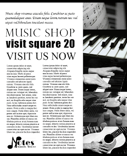
I wanted to stay black and white as much as I can, so I chose different pictures that are grayscaled. In photoshop, it was hard for me to align everything in the exact spot, but I tried to work it out. I think in creating a poster or brochure like these, Illustrator gives and provides a better and easier way of organizing. I was very careful in spacing between words but in a poster, wording can be very tricky. I tried to be as concise and clear as possible. I also wanted to stay with a modern theme and tone, so I was having trouble finding pictures with the same tones to it.
Thursday, February 23, 2012

Emphasis: Using color and Value


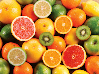
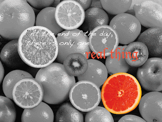
I chose a picture with a bunch of fruits are in it, and wanted to make one fruit stand out more than the others, so I used gray effect to make my background gray, and cropped one fruit out and them pasted on different layer. I think I should make my texts more stand out since I can't really tell what the texts are really saying. However, overall, I think this is one of my favorite works of all we have done in this class.

pictures BEFORE edited
AFTER edited with photoshop

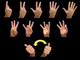
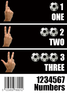
It looks more of a poster than a worksheet for learning. I wanted to create something for sign language, but cropping out all the alphabet took me a very long time, so I just chose the younger age children for my target population. Even thought it was a poster for learners, I wanted to be a little more creative, so I added bar code picture at the bottom to make it more of a poster than just a worksheet. I think harmony here is the font color, size, and the space between texts. I wanted be nearly perfect with the spacing so I zoomed in a lot to compare the length and width.

Thursday, February 16, 2012

Grouping Poster


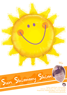
'Sunny' and 'Shiny' were my two words, and I tried to pick a picture with bright lighting in it, and I want the picture to have a warm theme to it, so I tried to use more warm colors. I grouped brush patterns and painting effect together to be more organized. I think the size of the texts at the far right bottom corner looks too little, but I think I should have used more 'Sunny' color to it, because no one could guess what my two words were, but I like the original picture a lot, so i just went with the greenish color theme. I also should haven't hide the sun from the original picture, so that the picture looks more sunny and shiny.

Grouping Challenge


These are my Grouping Challenge images that are created in Microsoft Powerpoint.
I tried to google each word to look at different images and concepts, and I know that even though powerpoint has a lot of designing tools, it was a little hard for me to be more creative.
I think it looks alright, but not the best I could do with it. For logic, I thought about 'think outside the box' quote, so I wanted to create a 3-D box image by using lines. For Anarchy, I used shapes so describe it. For escape, I thought I automatically thought about Fire Exits with signs, so I chose green for two arrows. For isolation, if you see it it looks almost similar with anarchy, but I tried to stand with different shape and colors. For celebration, I thought about fireworks, so I used star shape to create multicolor star fireworks. For unity, I typed unity on google, and it gave me a lot of pictures with circles are connected, so I went with them theme, again.

Thursday, February 2, 2012

Personal Poster: Photoshop

This is my personal poster. I tried to be crazy, so I used my extreme face-expression-pictures, and my name is Sun, so I picked Sun and Yellow as my theme. I feel like I should add more artifacts to this, but I just wanted to be simple :) I really wanted to think about repetition and composition. Since this was about my personal components, I wanted to have my 'personal' theme. I think it had a pretty strong impact since the background was white. I used grouping feature on Photoshop to group similar components together so that when I tried to move around, it was definitely easier for me. Even thought it doesn't have much of fancy design skills, I still love my poster :)