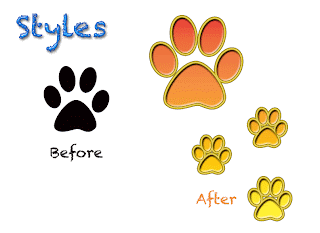
 I tried to use different colors and gradient styles for this part because Adobe Photoshop has tons of different styles to choose from. I chose stroke and gradient to add some impact to this image.
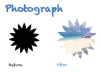 I was having troubles creating this/using this feature in photoshop, but my partner Rachael helped me a lot on this part, so it was easy to finish it with any problems. I chose a picture of a random beach from google images because the summer is coming :)
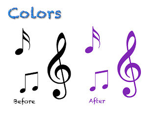 I just changed the color in this section, and it was not too hard. In photoshop, it was pretty easy to pick colors using color picker, so i played around a little bit, and I chose purple for my final image.
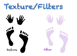
I knew how to play around with texture features so I tried to create my own texture but somehow it wouldn't let me create one. So I had to use the given textures in Photoshop, so I implied dotted textures to this image.
