Tuesday, April 10, 2012

Colors


I wanted to create a cover image for HARTS, and to stay simple and clear. I chose purple and gold because HARTs is located near Harrisonburg and James Madison Universy, and it seems to be creating a good harmony with those two colors. I added stroke features to different words to make it stand out itself. I also used a drop shadow for the HARTS logo. I did not know what to do with color assignment, so I had very limited time frame, but if I were given more time, I would definitely find better colors to create a poster like this. This can be added to our HARTS graphics as one signage, or it can be a name card for a HARTS.

Special Topic Presentation: Data Visualization


Our group had Data Visualization as our topic, and the video was saying that how visualization has impacted our daily lives strongly in every topics and environments, and how it has gotten easier for people to see information at once with visual-aids. According to wikipedia, it says "According to Friedman (2008) the "main goal of data visualization is to communicate information clearly and effectively through graphical means. It doesn’t mean that data visualization needs to look boring to be functional or extremely sophisticated to look beautiful. To convey ideas effectively, both aesthetic form and functionality need to go hand in hand, providing insights into a rather sparse and complex data set by communicating its key-aspects in a more intuitive way. Yet designers often fail to achieve a balance between form and function, creating gorgeous data visualizations which fail to serve their main purpose — to communicate information" Data visualization affected our lives so much, and we are so used to have it with us, it seems like we will be confused and lost if we do not have any visuals with certain infomation. So we had about 18 examples in our presentation, with different visuals to support the idea. There were tons of different ideas and types of various visualization such as graphs, timelines, and posters. We gathered few and put it in a prezi presentation which is another form and tool of visualization.

Monday, April 9, 2012

Icons ans Supporting Elements: Infographic of Conceptual Framework


My partner Rachael and I wanted to come up with a creative design, and that is why we went with the tree branch idea. We tried to use different colors for different competencies, so that it looks clear and nice, and anyone can easily define what competency belongs to an icon that is in a tree. We also wanted to stay with calm colors so that it won't hurt viewer's eyes but at the same time it had an impact so that it stands out itself. We were struggling when we were creating icons for couple competencies that were unclear in descriptions, but in the end, it worked out pretty well. We also had a little bit of a problem when we were to come up with the right words for each competency but Professor and other groups helped us to find the right wording. I think it looks perfect, at least to me :).

Tuesday, March 13, 2012

Practice with Photoshop: Shapes

I tried to use different colors and gradient styles for this part because Adobe Photoshop has tons of different styles to choose from. I chose stroke and gradient to add some impact to this image.
I was having troubles creating this/using this feature in photoshop, but my partner Rachael helped me a lot on this part, so it was easy to finish it with any problems. I chose a picture of a random beach from google images because the summer is coming :)
I just changed the color in this section, and it was not too hard. In photoshop, it was pretty easy to pick colors using color picker, so i played around a little bit, and I chose purple for my final image.

I knew how to play around with texture features so I tried to create my own texture but somehow it wouldn't let me create one. So I had to use the given textures in Photoshop, so I implied dotted textures to this image.

Gestalt Assignment


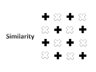
For Similarity, I used cross shaped images, copied and pasted. I did not want to use various shapes to create similarity, and I also thought that would be a little hard to create similarity with different shaped images. However, I used different angles and two different colors to separate two parts, but aligned them in the exact spots, so that it aligns perfectly.

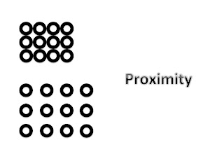
I re-placed 12 circles with different spacing so the shape itself looks smaller and tighter. Spacing and placement definitely control the proportion of the images. The closer the shapes are, the smaller the image gets. I have used Powerpoint to complete these assignments, so it was hard for me to control spacing between the shapes because Powerpoint does not have an automatic placement feature unlike Adobe Photoshop.
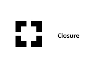
Even though each shape does not have full components to make a square, placing them close enough makes a perfect square in the middle. Just like in other section what I was struggling with, for closure, it was very difficult for me to place them in the exact right spot so it would make a perfect square. I used arrow keys on a keyboard to be as concise as possible, and this was the best I could do.


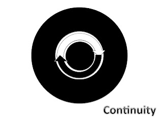
Continuity reminds me of the circle of life. Life patterns are circling around. People are born and die, and I wanted to use this idea to create something for continuity, so I came up with an idea which circles and arrows rotate. Even though it is not a moving picture, I think this final image seems to be flow around.

This assignment reminded me of Repetition because I used the same shapes over and over to make a new shape, and it also reminded me of Harmony because different shapes flow together to create one new image.

Tuesday, February 28, 2012

Alignment


I wanted to stay black and white as much as I can, so I chose different pictures that are grayscaled. In photoshop, it was hard for me to align everything in the exact spot, but I tried to work it out. I think in creating a poster or brochure like these, Illustrator gives and provides a better and easier way of organizing. I was very careful in spacing between words but in a poster, wording can be very tricky. I tried to be as concise and clear as possible. I also wanted to stay with a modern theme and tone, so I was having trouble finding pictures with the same tones to it.

Thursday, February 23, 2012

Emphasis: Using color and Value


I chose a picture with a bunch of fruits are in it, and wanted to make one fruit stand out more than the others, so I used gray effect to make my background gray, and cropped one fruit out and them pasted on different layer. I think I should make my texts more stand out since I can't really tell what the texts are really saying. However, overall, I think this is one of my favorite works of all we have done in this class.